Setting the bar for mobile-first retail banking.

Industry
Finance (US)
Tools
Sketch, Zeplin, Optimal Workshop, Userzoom
My role
UX/UI Designer

Highlights

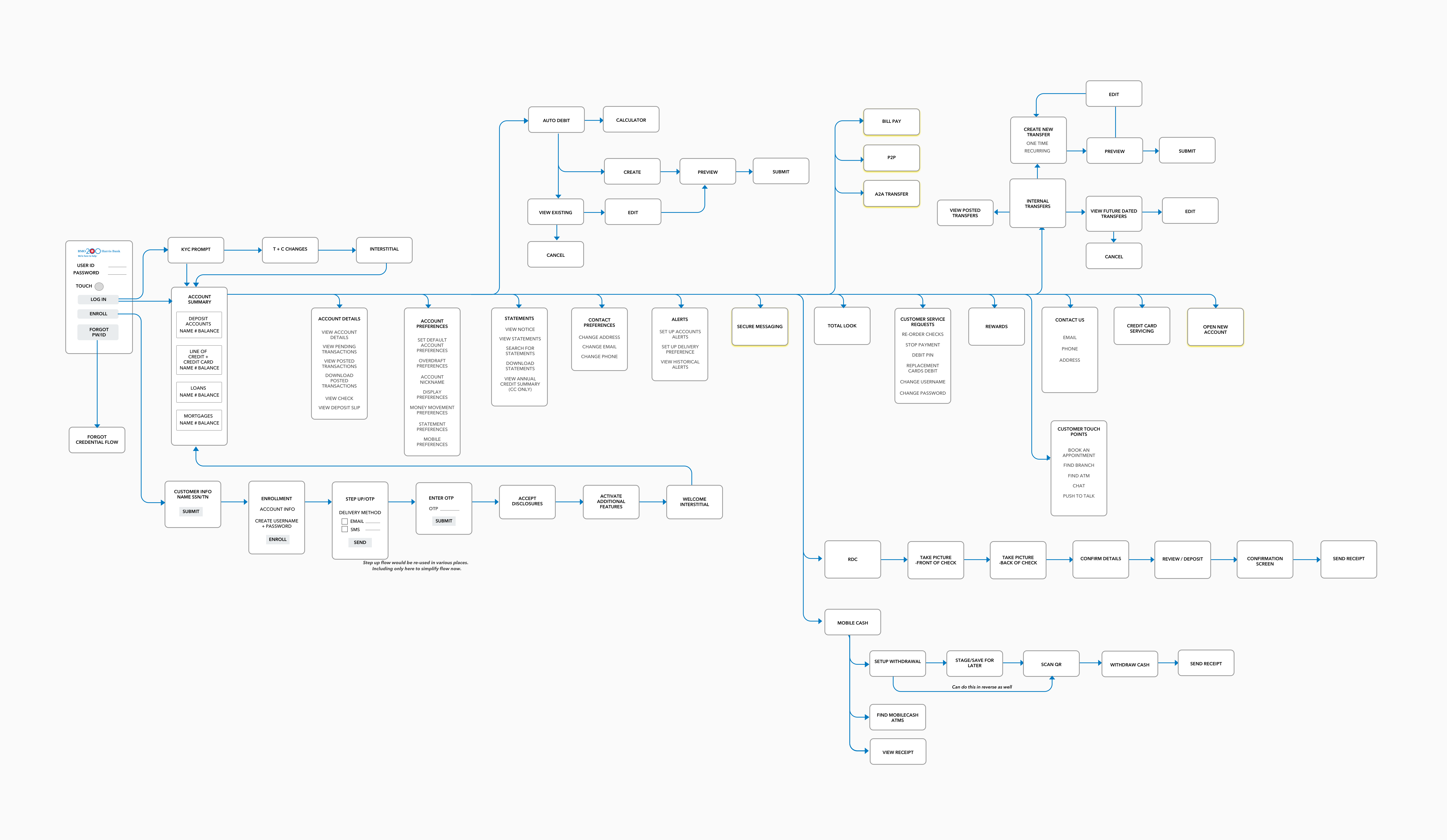
  • 36 new and enhanced features on desktop, iOS, and Android
  • 4.8/5 rating on the App Store, with 38.3k total reviews
  • In total, over 1,600 new screens designed by the team for the client application
Jump to
The problem ↓
The process ↓
The outcome ↓

The Problem

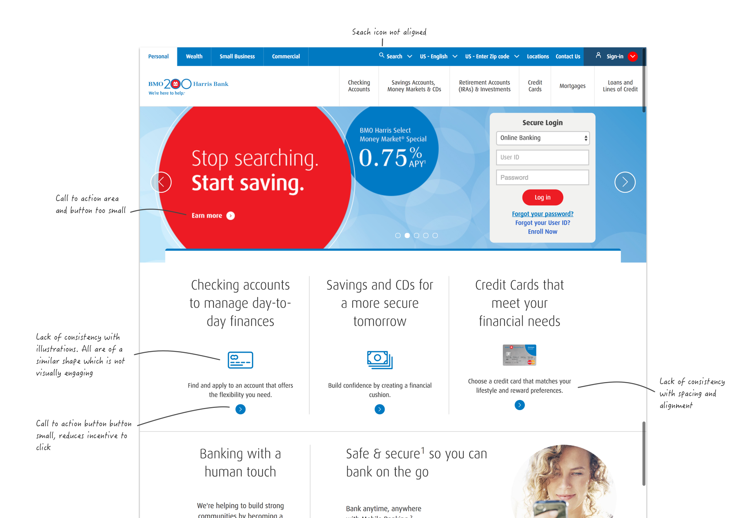
BMO Harris customers had to put up with a dated online banking experience which was over ten years old.

Customer Painpoints Hypotheses

Based on our assessment of the current experience, we made the following hypotheses about what the key pain points were:

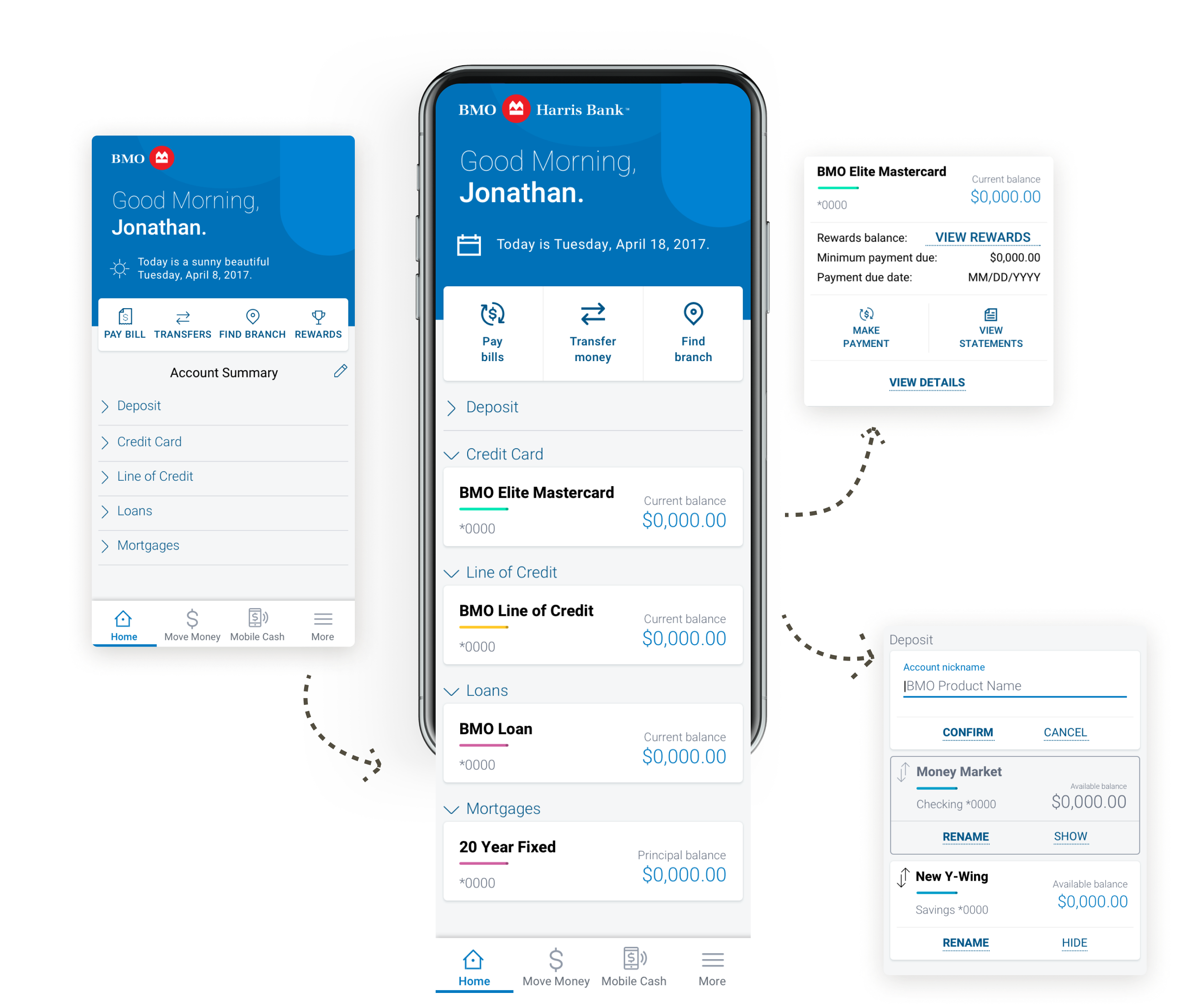
No cohesive experience

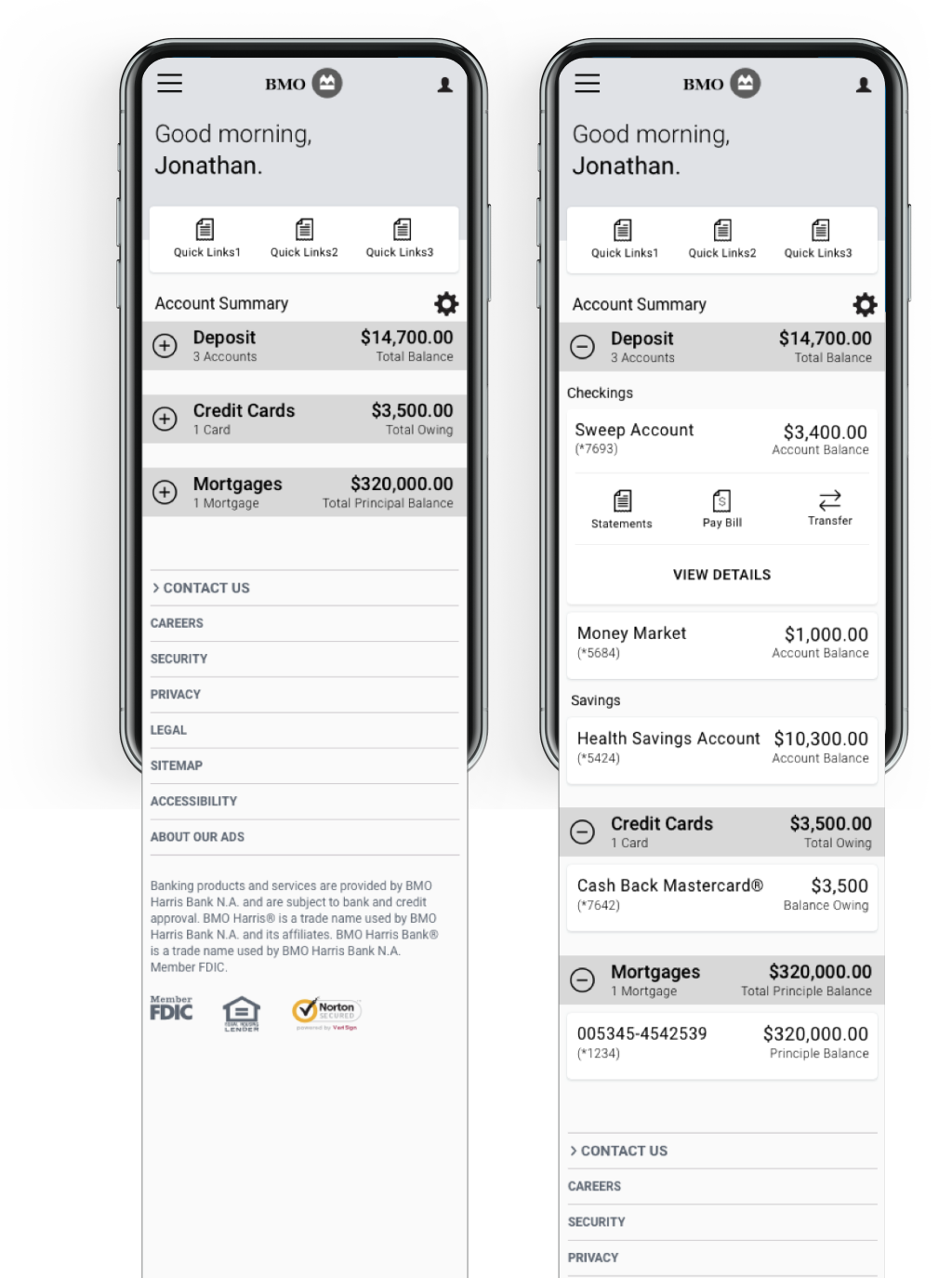
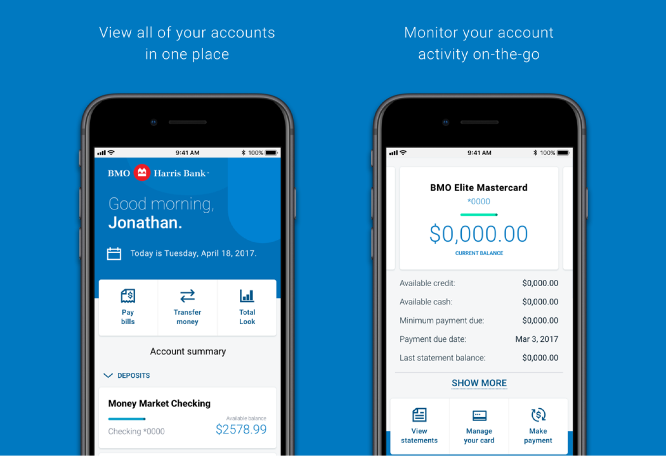
Customers don’t like having to exit the BMOH app to access their credit cards. They would prefer to see their credit card details under Account Summary.

Limited error recovery

Customers cannot recover from errors/mistakes on their own. They must rely on CSR for help. Currently, 80% of calls are related to password reset.

No onboarding

Customers don’t know the benefits of enrolling in Online Banking as the onboarding is not informative. Currently, they aren’t aware of how their banking experience could be better.

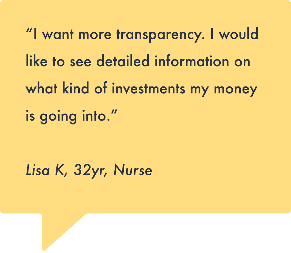
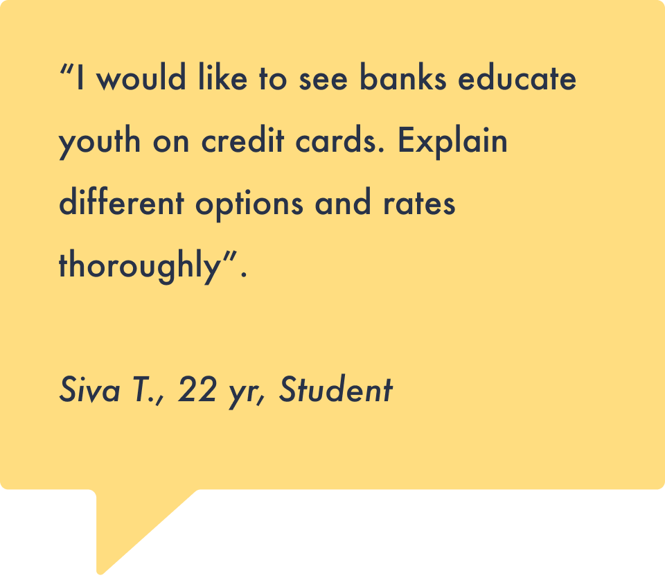
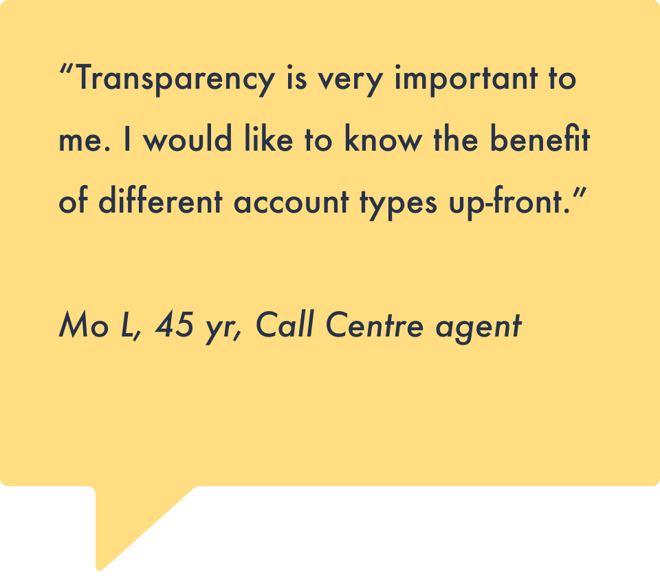
Guerilla interview findings

To gather more data about how people feel about their bank and finances,  armed with clipboards, we took to the Toronto streets.
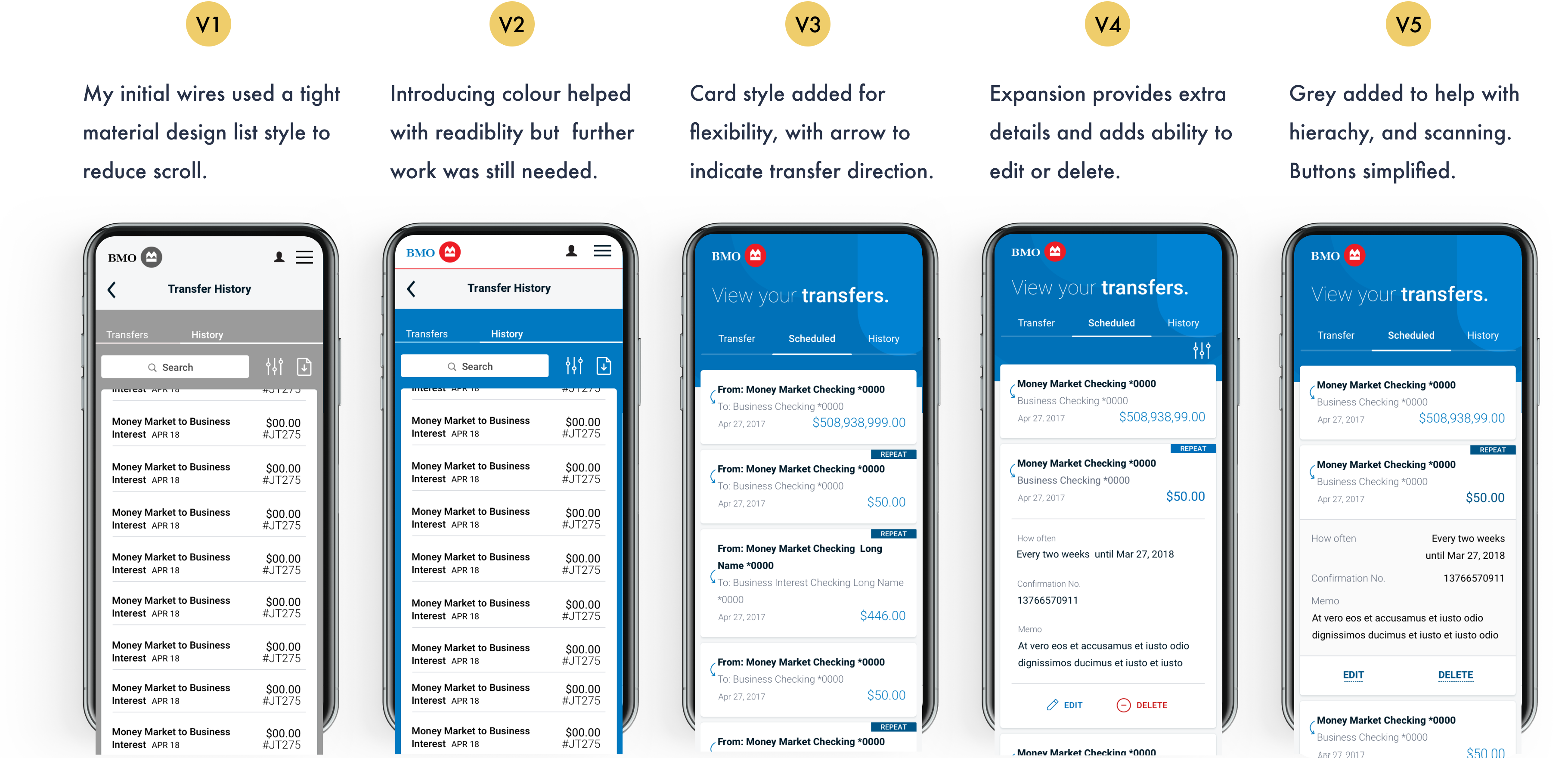
The Process

We went to Chicago and held a Design Thinking workshop with our BMO Harris stakeholders. We learnt a lot about the business goals, customer pain points and ideated improvements.

Consolidating workshop findings

We then looked into the journey maps and extracted key moments, pain points and opportunities.

Key moments

Including:

  • Potential customer decides to open a new account.
  • Potential customer walks into a branch.
  • User lands on Account Summary page.
  • Viewing transaction history.

Pain points

Including:

  • Temporary password must be changed by the customer.
  • Pop ups are disruptive, takes too much screen real estate, won’t load screen.
  • User is told they are signed out before they log in.

Opportunities

Including:

  • Confirmation message after completing transfer.
  • Completes Remote Deposit Capture.
  • Tracking progress through Total Look.
We then took the pain points and rewrote them as problem statements. We storyboarded out potential solutions.

Problem statement

“I think the problem is that there are too many steps to get into digital banking. This is felt by everyone. They need a convenient way to get online access to thier banking, because if they don’t they won’t use the account. It makes them feel trapped and frustrated.”

Brianna S.

BMOH executive

Pain points and insights uncovered from research led us to identify areas of improvement and innovation.

Improve
  • Make the digital enrollment process simpler.
  • Provide a seamless onboarding experience to various accounts and products.
  • Create consistent experiences across all products.
  • Have one centralized place for customers to set up and modify alerts.
Innovate
  • Login authentication using biometrics
  • Chatbot for frequent problem help.
  • Use machine learning to pre-populate fields and selection criteria based on customer’s habits.
  • Interactive tool tips for new users and introducing new features.

Architecture Mapping

To help the team and stakeholders understand how each flow relates to each other, I created this flow map. It was the first comprehensive flow map we had, and was therefore used frequently as a reference by the team, saving a lot of time an confusion as as worked on each area.

Fleshing out the core user experience

  •  Knowing that more and more customers were using phones for banking, we took a mobile first approach.  
  • We wanted to make good use of expand and collapse patterns so the user could easily access the information they are looking for without having to scroll too far.
  • We wanted to include contextual Quicklinks that become visible when you open a card, saving the user time while keeping it clean.
  • We wanted to make good use of expand and collapse patterns so the user could easily access the information they are looking for without having to scroll too far.

Making moves on Money Movement

In addition to working with the group on core areas like Account summary, I was appointed UX/UI Lead for all the Money Movement flows. These flows were crucial for the product since they make up the bulk of all user sessions.

In my first transfer wires iteration, I presented the user with one task at a time to reduce cognitive load.

Transfer history iteration

One flow that went through a  lot of iteration was Transfer History. 
My challenge was to present all the details within easy-to-scan cards.

Spec documentation

  • Final designs for Transfer History included cards that expanded twice - to show the essential details and again to show the log of changes to a particular (scheduled) transfer.
  • To ensure there was no confusion and make things easy for my developers, I created thorough spec documents for them to follow, ensuring smooth and efficient delivery.

Outcome


BMO Harris customers can now view all their accounts in one consolidated view, login with Touch ID on Android and Face ID on iOS, remote deposit capture a check, seamlessly transfer money to friends and family through Zelle without having to add funds to a secondary peer-payment account, and more.  

The BMO Digital Banking platform was rolled out to customers in two waves: the first wave took place on November 11, 2018 and the second on January 19, 2019. As of today, there are just under a million active users on the new platform.  

The new BMO Digital Banking platform has improved the customer experience and positioned 
BMO Harris as a digital leader in the industry.

Account Summary*
  • Our final designs for Account Summary didn’t stray too far from our original wireframes.
  • We kept ability to show and hide accounts based on type, and to expand the card to access Quick Actions.
  • In addition, we added in the ability to personalize the experience. The user can create their own Account Summary by rearranging accounts, hiding and showing accounts, and editing account names.

*UI by another designer.

Mobile cash
  • Mobile Cash allows users to withdraw cash without having to use their card.
  • As many customers were unaware of the feature, I included a walkthrough to explain how it worked.
  • To mimic the ATM experience and make it as fast as possible, I included a simple amount grid.
  • To make the experience super friendly included more illustrations for when they were waiting for their cash to dispense.
Transfers
  • We ended up creating our own custom account picker because using native pickers led to character count issues.
  • We introduced heirchy into the form by making the amount the focus. It adds a bit of joy, making it feel less monotonous, and is consistent with elsewhere in the experience where we highlight the amount.

Reflection

Account summary and Account Details.

Being fully end-to-end, I learnt an incredible amount on this project across the six months I was part of it. It was 'watergile,' which meant we had four weeks at the start to spend on discovery, allowing us to develop a complete picture of user and business needs before delivering.

Regarding what I would do differently, while I did get feedback from developers, I should have worked more collaboratively from the ideation stage because there were some flows where designs introduced extra complexity.

Face ID and Transfers.

We were able to deliver more efficiently once a design system had been established, but it would have been worthwhile to have focused on delivering that earlier.

Because this was such a big project with so many different screens, it would have been beneficial to establish a numbering system for how screens would be named in Zeplin early on. Overall, we underestimated the project's design scope and the importance of solid organizational systems and clear style guides to act as our foundation.