Helping airline passengers get travel-ready.
Industry
Travel tech
Type of project
Redesign of mobile
responsive webapp
Tools
Figma, Maze, Miro
My role
Solo designer, end to end product design

Background

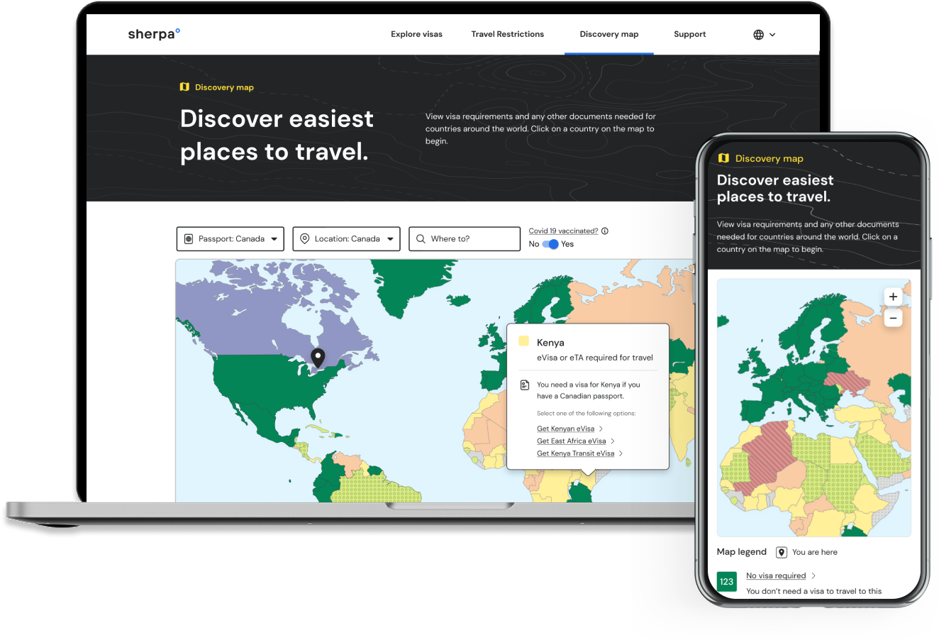
I led product design at Sherpa, a travel startup that partners with major airlines like British Airways, Delta, and American Airlines. Our focus is on assisting travelers in getting ready for their journeys by providing guidance on travel requirements and facilitating easy travel visas. My role encompassed the end-to-end design process, from user research and requirements gathering to ideation, wireframing, and high-fidelity design.

Jump to
The problem ↓
The process ↓
The outcome ↓

The Problem

When COVID-19 hit in 2020, airlines were struggling to keep up with changing travel restrictions. So sherpa designed an interactive map that gave travelers the latest requirements information.

91%

of the world’s population lived in countries with travel restrictions in April, 2020 - Pew Research Centre

It focused on COVID-related aspects like quarantine, testing, and vaccination. As restrictions lifted, this led to a green map, with users having to dig to find still-relevant information
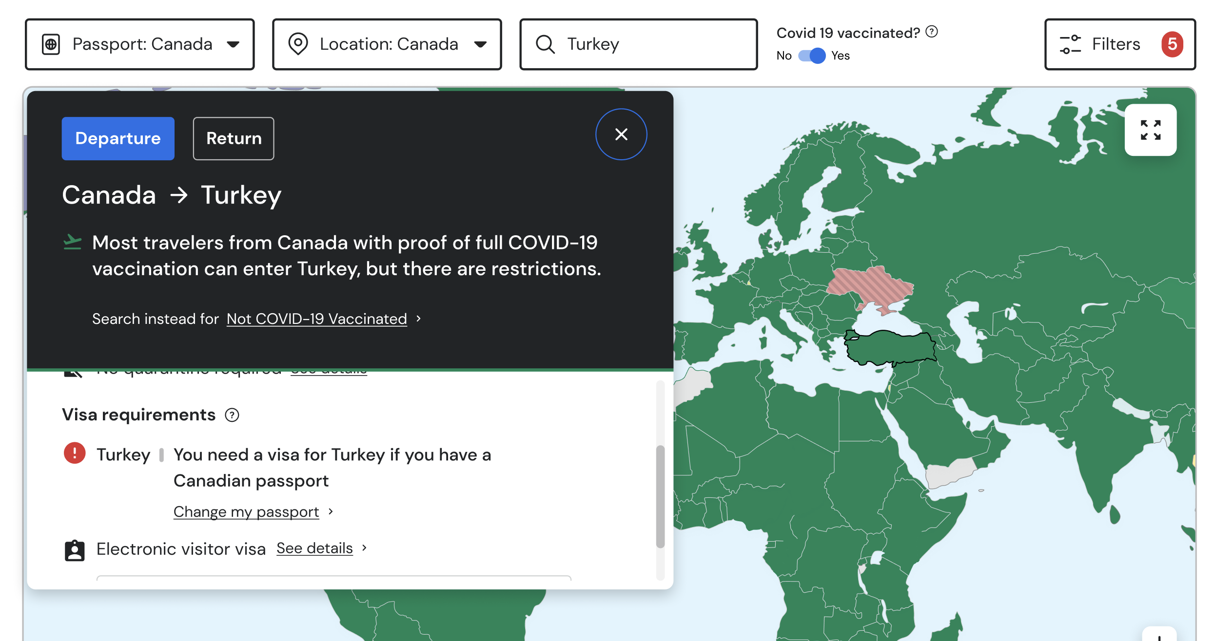
From a business standpoint, the emphasis on COVID-related information was distracting from our primary revenue drivers, which were now visas and travel authorizations.

90%

by July 2023, 90% of our revenue was from visas, travel authorizations and other documents

User Research

I did surveying in Maze to find out what the main factors were that influenced their choice of travel destination. I also asked about issues they had encountered when planning for a trip.
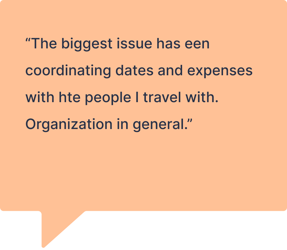
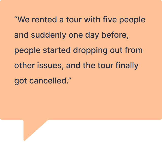
I did a card sorting exercise to find out what travel requirements information users thought was important for airlines to communicate with them. I found out that people cared more about visas and other documentation, which aligned with our business goals.

Ideation & wireframing

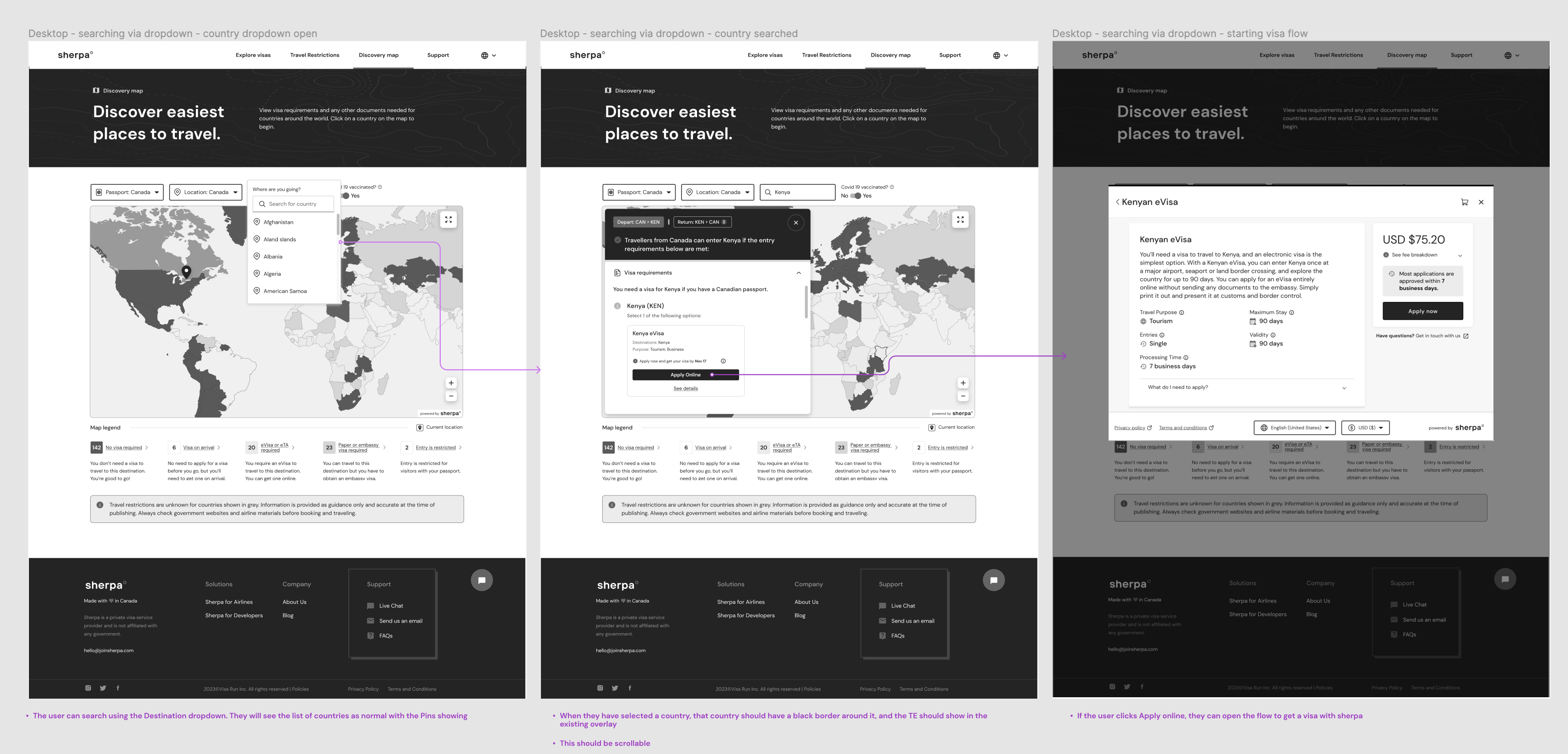
I started working on adapting the map and the information architecture through low-fidelity sketches and then interactive prototypes. I worked closely with the the product and engineering managers to get feedback.
Challenges

Redesigning the Discovery Map came with a number of challenges that kept me on my toes.

Accessibility

While the original map had included some considerations for accessibility, we had feedback from our airline partners that if the map was updated, accessibility needed to be a core focus.

Hover state UX

The direction from business was that we should include links to our visa flows within the country hover state for easy access. Links are atypical for a hover states, so I needed to make sure the interaction would feel natural.

Moving the map in-house

The existing product included a map, but used a third-party API, Mapbox. We wanted to  build our own map instead to save costs. I needed to work closely with the developers to ensure our solution was just as polished.

‘Visafying’ the map

I created new map categories and colour-coding based on visas and document requirements. This allows users to see at glance which countries require advance trip planning and embassy visits, and which destinations will open their doors to you if you want to fly out the next day.

Key design choices:

The ‘traffic light’ colour system which would let users see where they could travel to without documentation, which require a eVisa (available through Sherpa) and which require a Paper or Embassy visa (more difficult to get).

I simplified the field inputs for easier search capability, and for consistency across our other products.

ACCESSIBILITY

Designing for colour-blind users

The map needed to be accessible for colour-blind users, so to ensure that the categories would be distinct, I used textured patterns where colours were similar and the chrome extension Colourblindly.

A visa-focused hover state

When the user hovers over a country, they see what travel documents they need without having to refer to the legend. They can start visa flows with one-click.

Key design choices:

I designed a solution that worked in cases where there is only one visa option available, and for when there are multiple (such as when transit visas are an option). 


In cases where the user needs a visa but it is not offered by Sherpa or access to the country is restricted, the content makes clear that the user can click on the country to find out more details. 


A clean, updated guide

Users can click on a country to see all travel details, with visa requirements at the top, and other mandatory requirements and documents required.  Public health requirements including COVID-19 related requirements are still easy to find.

Key design choices:

I ensured all information that users said was important to them was in the viewport and did not require scroll.

I rewrote the content to make it more friendly, removing the word ‘restrictions’ which was leading to confusion, replacing it with the more open ‘requirements’.

WHITELABELING

Delta customization

Delta Airlines requested that we create a customized solution for their branding colours, for a fully consistent user experience across their platforms.  I designed three different options based on their palette, and made sure that all three were accessible.

Key design choices:

Delta Airlines has a number of blues in their colour palette. To help the user distinguish between them, it was important to use patterning.

To make the map feel more dynamic and not monotone, I used their coral accent colour for the departure country.

OUTCOMES

The new map doubled the level of user engagement.

2X

change in the number of Discovery Map views per month, from 50,000 to 100,000.

$10K

dollars saved in API costs per month for the company from building our own in-house map solution.

Reflection

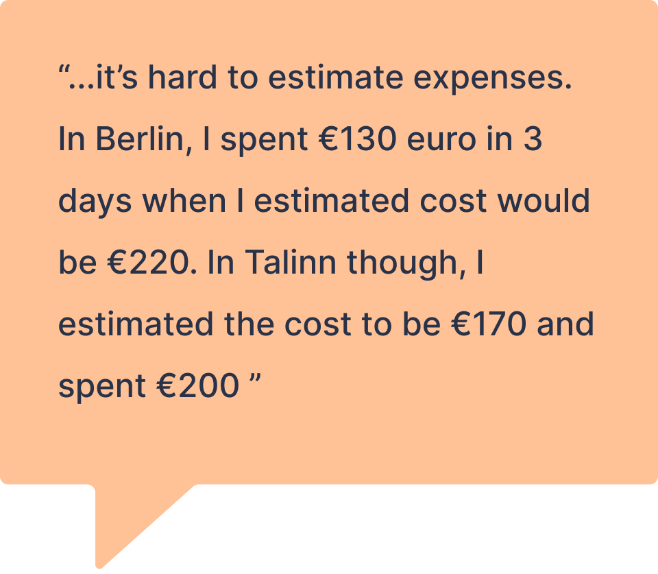
I was very excited to find out that I had the opportunity to redesign the Discovery Map because I had a lot of ideas for data we could add that would be helpful for travellers. Because travellers had told me budgeting can be challenging, I thought we could include the average meal and hotel room costs. Since many travellers mentioned safety was a concern, I thought we could consider adding safety data. 


For this project, however, we had a tight timeline. Airline partners had requested that we update the map

so for a quick turnaround, the focus needed to be on bringing visas and other travel documents to the forefront and deprioritizing COVID-related information.

I underestimated the QA effort that would be involved in moving away from the third-party map to our own. However, I sped things up with synchronous jam sessions with the developers. If I were doing handoff for this again, I would create a video walkthrough of the designs that they could refer back to.

Thanks for reading  - Now go check out the live Discovery Map!